Evaluation
I have created a website based on Jack Johnson, including 5 web pages which are a Home, Tour, store, Music, Video and a blog page. When you hover over the home page or the other pages it doesn't have a drop down menu, all you need to do is click on each one individually and it will take you to the page.
The home page includes 5 different images of Jack Johnson showing what he gets up to in life which I thought was a good idea as then when people will visit my website they will straight away look at the 5 images and see that it's about Jack Johnson. Even though the homepage is simple with having just 5 images I think that its also effective as it shows his life story. They will also see in the images that he is a music artist, a surfer, loves nature, etc.
The store page is for Jack Johnson's clothing of t-shrits, I got this idea from his own store page on his website. I liked using this for my website as i've always wanted to design a clothing website and this is pretty close to it and having a slight idea on how to design a clothing website I will try and have a go of doing one in the near future.
The tour page is showing when Jack Johnson will be touring next, a little nice idea I thought of what I included on my website was putting 4 national flags at the top of the page so that when people visit the website and go on to the tour page the flags will catch their eye and it will show for example a British, French, American and Holland flag so then when people see the flags they will know what country's he will be touring next.
The video page has a few of Jack Johnson's official music videos on their.
The music page has most of his latest tracks on there which you can listen to and it has all of his albums available there too which you can purchase by clicking on one of the albums which will take you to amazon, this was one of my favourtrite ideas with having his latest tracks on the website as sometimes it can be hard to find some music artists latest songs as they have only just came out but what I did was I went on to sound cloud and searched Jack Johnson and luckily enough it did bring his latest album up which has only just came out. I just then used that album which was on sound cloud and included it onto my website. The good thing about it is when browsing my website you will be able to listen to his full album while doing it.
The blog page has all the latest news on Jack Johnson I just copied the information for the blog from his own website on his blog page then I used it for my website and then laid it to how I wanted it.
At the start of this project I had quite a few different ideas on how I wanted my website to look and what to be about. At first I was going to do it on clothing, I had an idea of having vintage/modern clothing on the website a bit similar to the All saints style. All saints is shop that sells vintage/modern clothing if your wondering. So this was the best idea that I had in mind to base my website on, but before I rushed into things and just picked the first thing that came into mind I wanted to research into a load of different styles. I ended up coming up with quite a lot of good ideas but I still had the clothing one as my favourite still until I started looking at some music websites. I picked out quite of few music sites which I thought had a very cool look to it. So I collected all the best exciting music websites and had a look to see if I could pick any styles or designs they used on there sites. In the end I came across a website which was Jack Johnson's website and I really thought his site was cool/unique and after looking into his website I then knew that was what I wanted to do. I wanted to create a music website on Jack Johnson having a very chilled/vintage/summery style to it. All throughout the project I had that vintage idea in my head so because of that I though I would include it into my work. I will admit I did struggle with coming up with ideas on what to do but after browsing the internet and doing a mindmap, moodboard and siteplan that will helped me to progress alot better.
So having come up with the idea for my website which will be based on Jack Johnson I started sketching some layouts out for my website showing where the logo, navigation menu, main content, and footer will be placed. Doing these sketches were very successful for me to have ideas on where everything will be placed, so in the near furture i'll make sure I will concentrate on sketching my ideas out. After I did a load of sketches I wanted to see what they looked like digital so I went in to Photoshop and started creating the layouts on there from what I sketched out. After doing quite a few of them I ended up picking my favourite. So up to now I know that i'm doing a website based on Jack Johnson and I know what layout il be doing. All what I need to do know now is to add the imagery and text into it. Getting the imagery I thought would of been quite difficult as I wanted a few different images based on Jack Johnson like him surfing and playing the guitar but it was quite straight forward as the images were easy to find. I ended up finding out that he a big fan of how earth works so he's all into the nature stuff, I also found out that he is a surfer. Researching Jack Johnson has gave me a load more ideas on what imagery to get and how to style my website out. I started gathering images on Jack Johnson and then created a mood board which will allow me to pick the best images that will be used on my website. After I got the best images I started playing around with them in photoshop until I was happy with how I wanted them to be placed on my website. After I had all the images sorted out I needed to think of a colour for the background and other elements that will be used on the website, I thought by going with the vintage style I would go with a coffee paper/sandy colour look for the background. I thought the coffee colour would go well with the vintage look and the sandy colour would suit the website as Jack Johnson is always at the beach surfing. I experimented with both of colours and in the end I thought the sandy colour looked the best. I only really wanted to have 2 or 3 if needed throughout the website as if you used any more it could make the website too busy or cheap and also same for the imagery or text you should never overload on them too much. I was thinking of the other 2 colours that would go well with the sandy colour the first one that came into mind and the one that I choose to use was a browny colour I thought that went with the sandy colour very well. The other colour I choose was an orange colour, so on the homepage the main colour was the sandy colour which was used for the background, Facebook/Twitter logo and an effect which was added onto some of the images. The brown was the second colour which was used for the logo, navigation menu, main content, palm tree and the footer. The orange was used on a bit of the logo which I thought would be good to make the logo stand out a little more. It was used on the navigation menu for the text which was the home, tour, store, video, music and blog page. It was also used for a border on the main content just to give a bit more colour as it just looked boring. Throughout the website the colours are used in a similar way with the sandy colour as the background, the brown for the main content and the main text and little things like borders and effects used with an orange colour. I have also made sure with that text that I didn't make it too small or too much writing as I want people to be able to read my text as clear as possible as there's nothing worse than reading bad text.
The logo us done in a handwritten font which l think goes with the Jack Johnson style very well, I have also added a bird onto the logo which I thought was a great idea as Jack is all about the nature. The same goes for the silhouetted palm tree I used a silhouetted palm tree because it gives a simple but effective look to and again I didn't want to use to much colours so I needed the palm tree to be one colour. I also used the palm tree as Jack is from Hawaii and there is a load of palms trees around there so I thought it would be nice to add that onto the website. After I added all of the imagery onto the website I thought it looked really cool, but there was one thing that was missing. If people would go on the website they might not of know it was a music website as the homepage didn't really give a music vibe to it people might of thought that it was a nature website about Jack Johnson. To fix that problem I thought of a very cool idea it taken sometime to come up with the idea but it was all worth it. What I wanted to do was to something on the page that will tell you it is a music website a soon as you visit the website there was a few ideas that I came up with but the main idea which I used on the website was to make the navigation menu into a guitar neck. Having guitar strings going across the menu and having the guitar head at the far left of the menu. I was really happy with this idea and I thought it worked extremely well It was only a little simple thing added to the site but it just tells you straight away that the site is a music site.
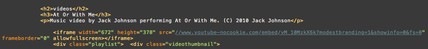
The multimedia that I have used on the site was 5 Jack Johnson videos which I embedded from Youtube. I also embedded a Jack Johnson playlist from his latest album, I embedded it from Sound cloud. I thought this was a good idea to use so that people can listen to his music whilst on his website. To add the videos and music I had to use html/css. I had to use the html to add the embedded link and I had to use the css to add the class and change the sizes and where to position the videos and playlists.
|
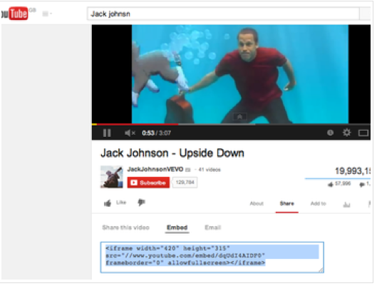
Youtube/EmbedOn my website I wanted to have a few videos putting on there so I needed to embed a video. To this I went to youtube and searched a video that I wanted. I then scrolled down until I seen the option for 'embed' when you've found that you'll need to click on it and there should be a link code similar to the one above saying (<iframe width=”420” height=”315” src=”//www.youtube.com/embed/dqUdI4AIDFO” frameborder=”o”
allowfullscreen<>/iframe>).The image on the right is showing the embed code from youtube used on coda this will allow the video to work on my website. |
|

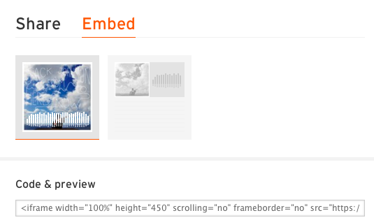
Soundcloud/embedThis is showing how to embed a song from soundcloud and paste it in a html file. All what you need to do is copy the embed code which is shown in a preview in the image to the left and then copy and paste the code into a link on a html file.
|
On the website I have made a store page where you can purchase Jack Johnson clothing. You wouldn't buy them of my website as it's not a really site but I have just shown an example of selling Jack Johnson clothes. If you go on my site and onto to the Store page if you click on a piece of clothing it will take you to the real Jack Johnson website and if you wanted you can buy some of his clothes from there. To do this I had to go onto Jack Johnson's 'real' website and go on to his store page and then copy the url and then add it on to my store html file I have also done the same with the Music page I added all of Jack's albums on the site and If you wanted to buy an album all you need to do is to click on one of them and it will take you to the Amazon website where you purchase an album or song.
The URL name for the website is 'www.elliottstrickland.com'. I choose my name because although my website was live it wasn't a website to use it was just a for my project. I thought if I was to call it 'www.jackjohnson.com' It could be copywriting so I just thought it would be better to use my name as I designed the website.
If was to pick my favourite page on the website it'll have to be the video page. I really like how I have laid it out, it did take some time to get the layout as I wanted it which is shown how I did it in tone of my write-ups. It was defiantly worth the wait of trying to get the layout I wanted as I wanted it to be perfect and I have learnt quite a few things trying to do it. I was to do this page from scratch I probably wouldn't change much at all but if I had to change something it would probably be to add more videos than I did to show variety of Jack Johnson's music videos. On this page I have just used a simple font as I have done on the other 4 pages like I said I want to keep the writing as readable as possible because on a website people don't really pay attention to what the text looks like as much they might do with logo's but not text. There more bothered about the information the text has not how it looks.
The homepage is my less favourite page of them all even though I like the look of it I think I would of liked to do more with it as there is only 5 images on there that don't really do much. If the images took you somewhere then yes it would be different so if I was to do this page again I would either have a slideshow of Jack Johnson images of his life or I would have the images take you to another page for example I have a image of Jack Johnson surfing on the home page and it would be good if you clicked on that image that it would take you to a page on a article of him surfing.
I created a questionnaire on survey monkey asking people what they thought about my website and what needs improving. There was a couple of negative feedback which is a good thing because i'll know what I need to do in the future if I was to design another music website. There was a comment made about the website being a bit boring and needs to be more exciting I can see what there on about it probably does need to be a bit more exciting but I think of Jack Johnson as being chilled and cool so I wanted to try and make the website as similar as he is and I think I achieved that quite well. Someone also made a comment saying that one of the pages wasn't working for example say you went onto the store page and then back to the home page it would bring a error page up it was doing this because there was letter missing in the html file which sounds a bit stupid but you when working in html/css you have to make sure that everything is perfect and you haven't missed anything out. Besides that i'm really happy that they told me that because I probably wouldn't of noticed and even though the website wasn't going to be used for real I think it's still very important that you try and make the website as perfect as possible. There was another comment saying some of the text was a bit blurry so I had a look through my website a few times and I couldn't really see the problem if it was then yes it probably should be like that.
There was a variety of websites that I used for my website which were survey monkey, weebly and I used W3 schools a lot which is where I got my information from when doing my design work in html/css. Weebly is a great thing to use it has made me so much better with my work by making me more organized and nearly all of your work is saved and will never get lost as I can be so bad for a lot of the time so i'm very happy that I used weebly and will do in the future. Creating this website I have learnt so much I don't even know where to start it has defiantly helped me more in organizing my work. The main thing that I have learnt is how to make a website and make it live. I had to do a lot of research in websites and how they are made before I started mine. I had to research all the codes which makes a website work which I found it very difficult at first I found it a bit similar to learning a new language. Having researched it and trying it out myself I can seem to read coding a lot easy than I did. I do still think I can get a lot better and improve my skills in coding and web design and just think it will take time but that's what it is all about your always learning new things.
Throughout this project I did have a couple problems. The main one was not finishing things of and then going back to them near the end of the project. I didn't do this at the start of the project it was more to the end. This was either due to having time off or being slightly unorganised by not writing down what I have just done and what I need to do next. So having the time off has defiantly effected my work throughout the project I can't really do much about being of as I have been ill or on holiday what I should do though is I should made up for the day I missed and did it another day which I don't think I did so well. Next time i'll have to make sure I do this.
Another thing I really struggled with what I mentioned above was remembering the coding. I don't think you are meant to remember them straight away as there are loads of codes to learn. There is one thing you need to do though which I did but I could of done a bit better is to go over the codes you have used throughout the project all of the time which by doing that a few times for me it has really helped me a lot.
